Tuesday, September 25, 2007
Redesign In "BLUE," 3
So, the new design is done. From its initial sketches, to its first design, to the current. Now, I have to animate the thing, or at least see how it translates. So I threw together a cape and hair move, with some stuff happening around him. Please do excuse the video garbage that pops up.
Tuesday, September 18, 2007
Redesign In "BLUE" Continued...
From his first design concepts, Bartz the Blue had a cape. He wasn't designed to be without it. Another reason a redesign was necessary, I wanted his outfit to work with or without his cape and I didn't feel this design did.
The new design with more detailed colors sans cape...
I wasn't getting rid of the cape, I just needed a stronger option of the character without it. The new design with more detailed colors with cape...
The new design with more detailed colors sans cape...
I wasn't getting rid of the cape, I just needed a stronger option of the character without it. The new design with more detailed colors with cape...
Wednesday, September 12, 2007
Redesign In "BLUE"
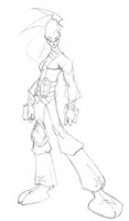
In the midst of everything else that's going on, I am in the middle of redesigning some of the characters in "Bue Dragon Blues." Not that I don't like their current designs, I just think some of them could be pushed a little more. Let's start with the main character Bartz the Blue.
First off, his design needed a little more to it. It had nice elements but that felt flat to me over time. I also felt there needed to be more consistency in his outfict overall. I added a knee pad and made a new belt buckle similar in design. Here are 2 of the more finished looks of this.
I was fine with the additions, but I also wanted the character to look younger and the design to be pushed a little more to a "cartoony" feel. This was more final.
This image was cleaned up and colors were added to bring you this...
Tuesday, September 4, 2007
Been Awhile
Wednesday, June 13, 2007
Paper Sack Brown, Ep. 2
Working on the second episode of Paper Sack Brown, which will be done very shortly. Here's a quick shot of the characters that will be in that episode.
From left to right, Sonny, Sindie, and Marc. This next ep is gonna be hot. And by hot I mean, I may have to put a parental advisory on it. Stay tuned.
Monday, June 11, 2007
Sketches and News
Wednesday, May 30, 2007
Friday, April 13, 2007
Wednesday, April 11, 2007
Sketch Process: Robin Redesign cont.
Sketch Process 01: Robin Redesign
Here's a quick walkthru of my drawing process with Digital Webbing's "Girl Wonder" redesign going on in the "Draw Off" section.
here's my beginning scratches, working out design. i usually draw a basic form and throw all types of ideas on it, there's multiple "r" placements, different types of boots goin' on. i have to squint alot to block out some aspects, but i get a whole bunch of crap happening.
from that, i take what i want and leave the rest. went from four pouches to two, got rid of the boots, no knee pads, still messing around with the "r" placement.
then i'll play with that simplified design, still working out elements. love the "r" on the bottom of the foot, i can see that imprinted on someone's head after a kick to the face.
keeping what i want, i draw the more detailed sketch, but this will change some once i outline it...
Street Fighter Ken
Tuesday, April 3, 2007
Friday, March 30, 2007
Rise of the AMERI-MEN
Wonder Woman, Sort of
Wednesday, March 21, 2007
Cuttin' Records
Saturday, March 17, 2007
YouTube Channel
I've posted a few of my creative endeavors on YouTube with a channel I call, Creative Leftovers.
I drew a redesigned version of the Wonder Twins for Comic World News a while back, but I had to see them transform into something, so I did a little Flash movie you can see below.
The same goes for a Mazinger Z. There was a Mazinger Z/Giant Robot Draw Off over at Digital webbing, and I couldn't draw the robot without showing him do his signature rocket punch.
Subscribe to:
Posts (Atom)